![]() foolish fly fox's blog
foolish fly fox's blog
--Stay hungry, stay foolish.
--Forever young, forever weeping.
数据可视化
数组的显示
cmap 的使用
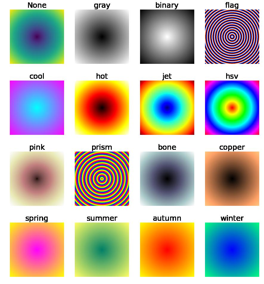
创建一个的数组:
tp = np.arange(-3, 3, 0.01)
x, y = np.meshgrid(tp, tp)
digit_a = (x**2+y**2)**.5
对该数组以各种 cmap 进行可视化:
import matplotlib
import matplotlib.pyplot as plt
def show_array(a, n, cmap=None):
    plt.subplot(1, 4, n)
    plt.title(cmap)
    if cmap : plt.imshow(a, cmap)
    else : plt.imshow(a)
    plt.axis('off')

plt.figure(figsize=(15, 15))
# 默认情况
show_array(digit_a, 1)
# gray 最小值-黑色 最大值-白色
show_array(digit_a, 2, 'gray')
# binary 最小值-白色 最大值-黑色
show_array(digit_a, 3, 'binary')
# flag 包含红色、白色、绿色和黑色
show_array(digit_a, 4, 'flag')
plt.show()

plt.figure(figsize=(15,15))
# cool 包含青绿色和品红色的阴影色, 冷色调
show_array(digit_a, 1, 'cool')
# hot 从黑色平滑过度到红色、橙色和黄色的背景色,然后到白色,红外成像
show_array(digit_a, 2, 'hot')
# jet 从蓝色到红色,中间经过青绿色、黄色和橙色
show_array(digit_a, 3, 'jet')
# hsv 从红色,变化到黄色、绿色、青绿色、品红色,返回到红色
show_array(digit_a, 4, 'hsv')
plt.show()
plt.figure(figsize=(15,15))


# pink 柔和的桃红色
show_array(digit_a, 1, 'pink')
# prism 重复这六种颜色:红色、橙色、黄色、绿色、蓝色和紫色
show_array(digit_a, 2, 'prism')
# bone 具有较高的蓝色成分的灰度色图
show_array(digit_a, 3, 'bone')
# copper 从黑色平滑过渡到亮铜色
show_array(digit_a, 4, 'copper')
plt.show()

plt.figure(figsize=(15, 15))
# spring 包含品红色和黄色的阴影颜色
show_array(digit_a, 1, 'spring')
# summer 包含绿色和黄色的阴影颜色
show_array(digit_a, 2, 'summer')
# autumn 从红色平滑变化到橙色,然后到黄色
show_array(digit_a, 3, 'autumn')
# winter 包含蓝色和绿色的阴影色
show_array(digit_a, 4, 'winter')
plt.show()
效果为:
用 matplotlib 绘图
首先应该说明一下绘图库 seaborn 和 matplotlib 的关系:
Seaborn其实是在matplotlib的基础上进行了更高级的API封装,从而使得作图更加容易,在大多数情况下使用seaborn就能做出很具有吸引力的图,而使用matplotlib就能制作具有更多特色的图。应该把Seaborn视为matplotlib的补充,而不是替代物。
所以,不是说为了图方便直接掌握 seaborn 绘图就好了,很多时候,matplotlib 绘图更加方便灵活。
绘图必须引入的库:
import matplotlib
import matplotlib.pyplot as plt
绘制直方图
绘制提供了数据的直方图,可以使用函数 plt.bar
plt.figure(figsize=(10, 7)):指定绘制图的大小;
plt.bar(x, height, width=0.8, bottom=None, hold=None, data=None, **kwargs)x:直方图指定位置条形的中心点对应的 x 位置height:对应位置条形的 y 值weight:对应位置条形的宽度color:颜色,如 “#00bffff” 指定颜色为天蓝色,也可以写为 "deepskyblue"alpha:透明度,0~1 之间label:对应的条形名称,需要调用plt.legend才能显示edgecolor:条形边框颜色lw:也可以记为linewidth,条形边框的宽度
plt.legend(loc="upper left", fontsize=15):指定图示的显示loc:图示显示的位置,有best、upper right、upper left、lower left、lower right、right、center right、center left、lower center、upper center、centerfontsize:图例文字大小
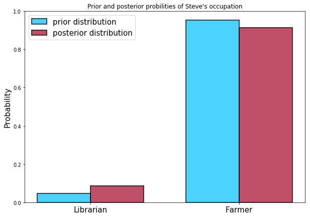
plt.xticks([0.125, 0.825], ['Librarian', "Farmer"], fontsize=15)- 参数1:x 轴记号的位置
- 参数2:记号文本
fontsize:字体大小
plt.title("figure title"):设置图片标题
plt.ylabel('probability', fontsize=15):设置 y 轴含义
plt.show(): 显示图片
import matplotlib
import matplotlib.pyplot as plt

colors = ["deepskyblue", "#A60628"]
prior = [1/21.0, 20/21.0]
plt.figure(figsize=(10,7))
plt.bar([0., 0.7], prior, width=0.25, alpha=0.7,
        color=colors[0], label="prior distribution",
        lw="2",edgecolor="#000000")
posterior = [0.087, 1-0.087]
plt.bar([0.+0.25, 0.7+0.25], posterior, width=0.25, alpha=.7,
       color=colors[1], label="posterior distribution",
       lw="2", edgecolor="black")
plt.legend(loc="best", fontsize=15)
plt.xticks([0.125, 0.825], ['Librarian', "Farmer"], fontsize=15)
plt.title("Prior and posterior probilities of Steve's occupation")
plt.ylabel("Probability", fontsize=15)
plt.show()
显示为:
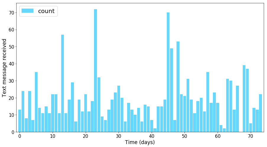
另一个例子:
import pandas as pd
import seaborn as sns
data = np.array((
    [ 13.,  24.,   8.,  24.,   7.,  35.,  14.,  11.,  15.,  11.,  22.,
        22.,  11.,  57.,  11.,  19.,  29.,   6.,  19.,  12.,  22.,  12.,
        18.,  72.,  32.,   9.,   7.,  13.,  19.,  23.,  27.,  20.,   6.,
        17.,  13.,  10.,  14.,   6.,  16.,  15.,   7.,   2.,  15.,  15.,
        19.,  70.,  49.,   7.,  53.,  22.,  21.,  31.,  19.,  11.,  18.,
        20.,  12.,  35.,  17.,  23.,  17.,   4.,   2.,  31.,  30.,  13.,
        27.,   0.,  39.,  37.,   5.,  14.,  13.,  22.]))
x = range(len(data))
plt.figure(figsize=(15,8))
plt.bar(x, data, width=0.85, color="#00bfff", alpha=0.6,
       label="count")
plt.legend(loc="upper left", fontsize=20)
plt.xticks(fontsize=15)
plt.ylabel("Text message received", fontsize=17)
plt.xlabel("Time (days)", fontsize=17)
plt.yticks(fontsize=15)
plt.xlim(-1, len(x))
plt.show()
对应图形为:
下面再来绘制泊松分布:
import numpy as np
import scipy
def poisson(lamd, k):
    return lamd**(k)*np.exp(-lamd)/scipy.misc.factorial(k)

k = np.arange(15)

lamds = [2, 5, 10]
colors = ['#00bfff', "#ff7f00", "#8a2be2"]
linew = 0.3
plt.figure(figsize=(10, 8))
for i in range(len(lamds)):
    lamd = lamds[i]
    plt.subplot(len(lamds),1,i+1)
    plt.title(f"$\lambda = {lamd}$", fontsize=15)
    plt.bar(k, poisson(lamd,k), color=colors[i],
            alpha=0.8, width=linew)
    plt.tight_layout()
plt.show()
其中函数 plt.tight_layout 避免图标题和上一幅图的指标标记重叠,绘制的图像为:
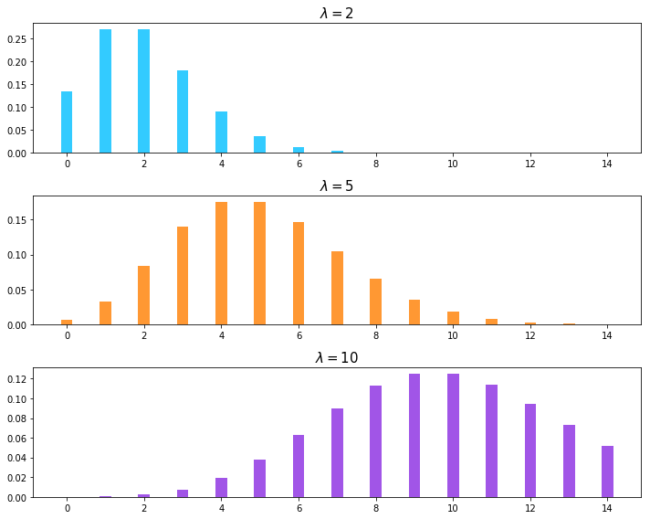
泊松分布的期望是:。